
Open your magazine layout and critically look at the rough layout you’ve made for the first article.
Check if your images are technically correct.
- Enhance the images in Photoshop if needed (it needs to be 300dpi for printed magazines).
- Do all the elements that go to the edge of the page bleed off? If not, make sure they do.
Now, take a long, hard look at the body text. See how many ways you can enhance the text by the use of:
- pop-up blocks;
- integration of text and pictures;
- any other graphic elements like labels, stickers, frames, or icons;
- can you enhance the intensity of some elements by adding negative space?
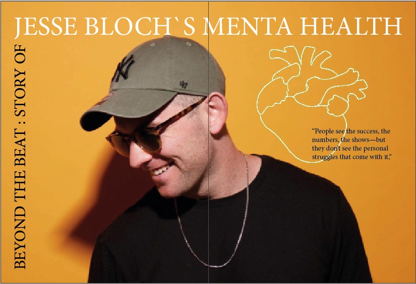
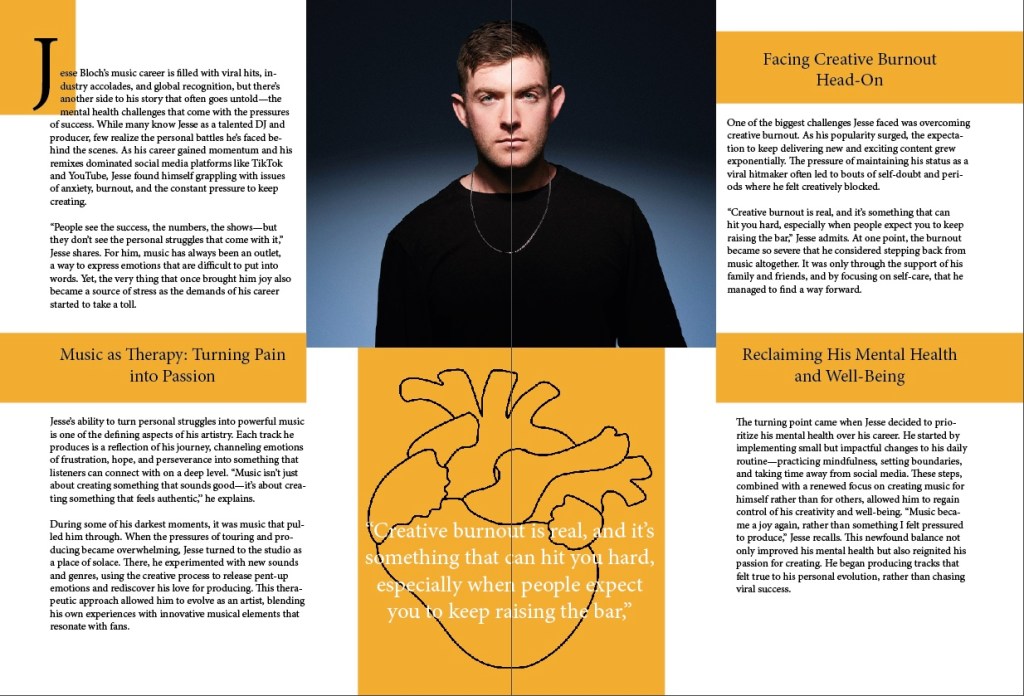
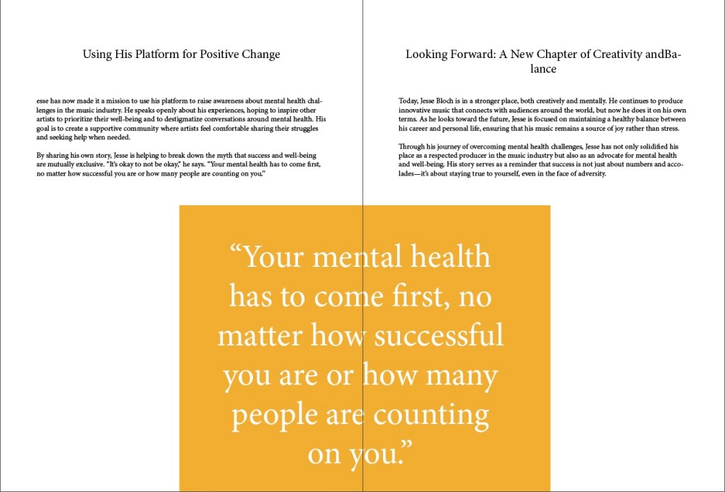
Now I have worked some further into the layout of the first article, and I am far from finished. But I start to see how I want it to look like for this one. It’s fun to add, take away and try different ways with font sizing, images, pop up block and so on. Here are the pages so far!
KOK- 25

Leave a comment