
Share your progress on the Discussion Forum to get feedback and tips from the tutors on your article layout. Implement this feedback on your design and keep it in mind when doing the rest of the articles.
Here is the article after the feedbacks , from the tutor.
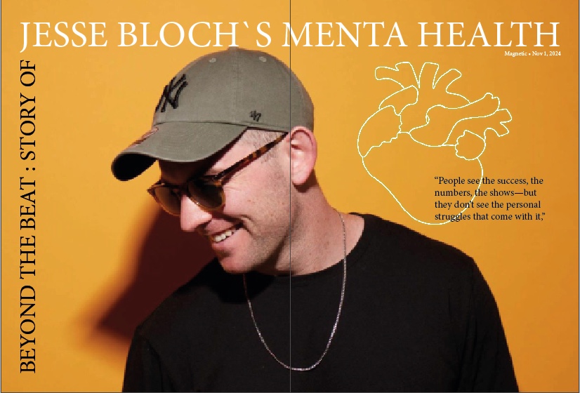
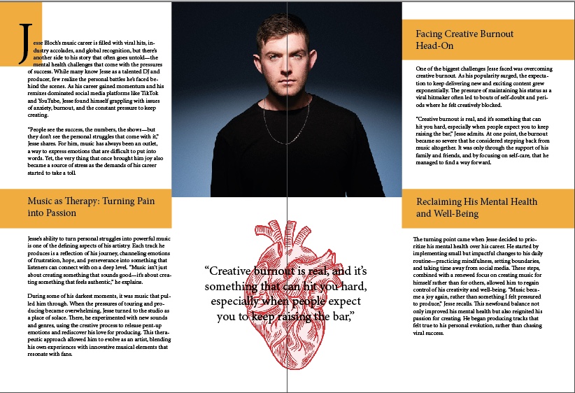
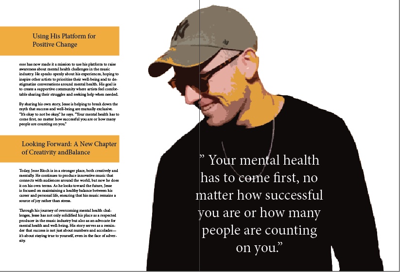
About the article, it is working very well. The contrast between the yellow and darker photograph colours are striking. I also think your use of white space is good. Some things you could consider improving:
- The text that runs through the gutter of the two pages might become problematic and read difficult.
- Rather avoid the orphan half-word on the last page (ba-lance) I would break up the lines so that it balances better, like for example, Looking Forward: A new Chapter of >> Creativity and Balance
- Maybe consider playing around with the layout a bit, like using the second photo of the first spread on the second spread rather, to ‘fill’ it a bit more with content. You could just leave the open space where the photograph was as negative space. Also, consider keeping the sub-headings on the second spread in yellow blocks to be more consistent with the first page spread.
KOK-25

Leave a comment