
1
Here’s a fantastic piece of motion design by Elastic. They carefully consider the design principles we’ve learnt about today – but can you spot them?
Step 1 – Watch the video carefully and analyse each shot.
Step 2 – Take screenshots and write a motivation on where your spot contrast, emphasis and balance.
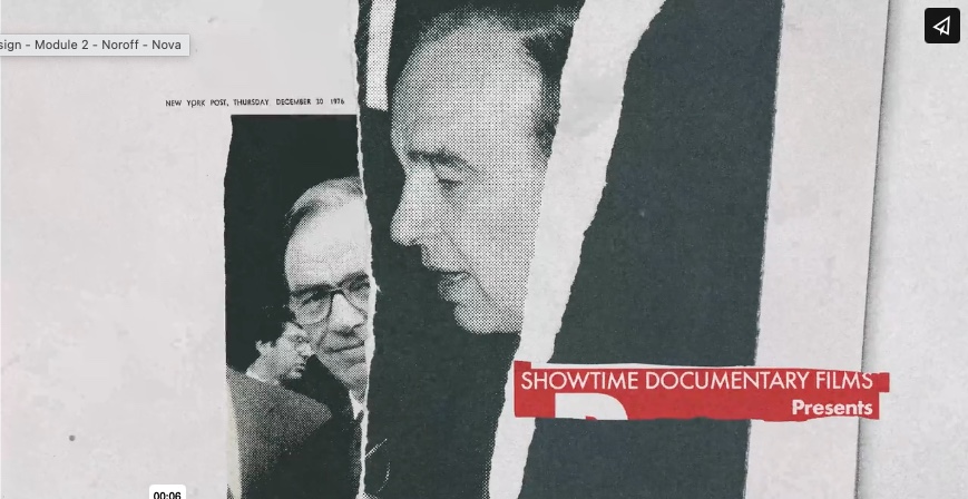
Here you see the colours black and white with the contrast color red. The red color makes you look at that point first. The red color is also the emphasis that takes your eyes to that point first. Its a good balance with negative space , bold color and a clear font.
Part 2
A sports brand is launching three new products: ‘Noon’, ‘Kayak’ and ‘Radar’. They also happen to be three palindromes to make our design choices a bit easier.
- Step 1 – Pick one of the words above.
- Step 2 – Create a quick logo that has contrast, emphasis and balance.
- Step 3 – Write down how you added the above principles.
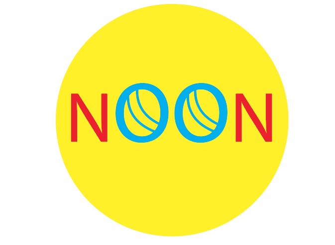
I picked the word NOON, I got the idea of making the two O´s into balls.
KOK-25

Leave a comment